Live in Ease
Year
2024
Type
Logo Design, Branding
Tools
Illustrator
Bryan Kappe, a local chiropractor with a holistic approach to care, required a personal brand and business card to attract new clients. Previously, Bryan Kappe had a small practice named Live in Ease, which he started during the pandemic, servicing clients from his home office. Now, sometime later, during this project, he was providing his services to other practices and gyms, hoping to attract some clients he could care for directly.
THE PROBLEM
Bryan had a logo he was using. However, it had poor legibility and lacked a substantial visual impact. When speaking with Bryan, he had created all his visual assets himself, using limited tools. His business card, in particular, lacked some consistency in type size and alignment. I felt it was essential to address this because a lack of professional design may deter potential clients and cause issues with reading the information.

To start, I gave Bryan a small questionnaire to get us started. The questionnaire helped distill some of Bryan's thoughts into a few keywords he would like the brand to embody. He stated he wanted the brand to feel modern, friendly, and high-end. Once I obtained some of that information, I began brainstorming through small sketches and thumbnails. For Bryan's logo mark, I explored various ideas related to the spine, motion, or emulating balance, focusing on Bryan's holistic approach.
To start, I gave Bryan a small questionnaire to get us started. The questionnaire helped distill some of Bryan's thoughts into a few keywords he would like the brand to embody. He stated he wanted the brand to feel modern, friendly, and high-end. Once I obtained some of that information, I began brainstorming through small sketches and thumbnails. For Bryan's logo mark, I explored various ideas related to the spine, motion, or emulating balance, focusing on Bryan's holistic approach.

I gave Bryan an initial round of designs, one which is shown here. I had a few more with other typefaces, but for brevity, not all are shown. Bryan had a few notes we discussed over a phone call. Bryan felt it needed to "pop more," and he didn't like the typeface chosen for the logo. He also thought that he didn't want "Live in Ease" for the word mark but rather his name, which he had in the sub-line. In further discussion, Bryan revisited some of the keywords, and we decided to go for something that gave a sense of athleticism or was a bit sportier. Once making those tweaks and choosing a different typeface, we ended up at a result that Bryan loved.


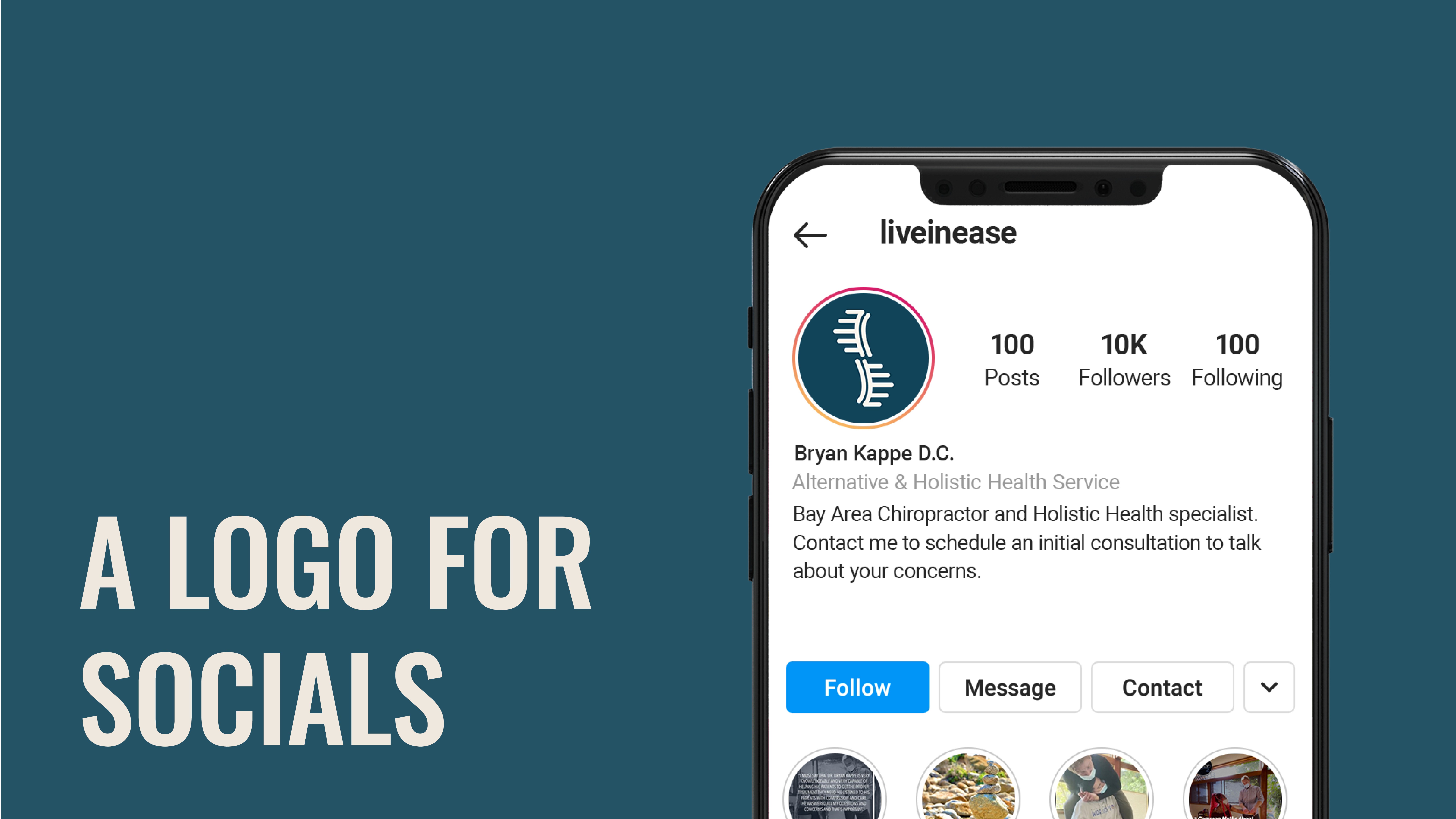

I gave Bryan an initial round of designs, one which is shown here. I had a few more with other typefaces, but for brevity, not all are shown. Bryan had a few notes we discussed over a phone call. Bryan felt it needed to "pop more," and he didn't like the typeface chosen for the logo. He also thought that he didn't want "Live in Ease" for the word mark but rather his name, which he had in the sub-line. In further discussion, Bryan revisited some of the keywords, and we decided to go for something that gave a sense of athleticism or was a bit sportier. Once making those tweaks and choosing a different typeface, we ended up at a result that Bryan loved.